Creating User-Friendly Interface with Bootstrap Admin Template
In today’s digital age, user experience plays an important role in the success of web applications, especially Bootstrap Admin Template. These interfaces should be intuitive, responsive and efficient to help users manage tasks and access information quickly. Bootstrap, a widely used front-end framework, provides an excellent foundation for building beautiful and functional Dashboard Templates. This article explores how to create user-friendly interfaces using Bootstrap, focusing on essential design principles and practical tips.
BUY NOW
Unique Pro Admin
Understanding user needs
Before diving into the technical aspects of interface design, it’s important to understand who your users are. Admin dashboards are typically used by a variety of users, from data analysts to system administrators, each with their own goals and functions. Conducting user research, such as surveys and interviews, can help identify the specific needs, preferences and pain points of your target audience. This understanding will guide your design decisions, ensuring that the final product meets users’ needs.
Prioritizing simplicity
One of the basic principles of user-friendly design is simplicity. A cluttered interface can overwhelm users, making it challenging for them to find the information they need. Bootstrap’s grid system allows for an organized layout, which can help prioritize essential information.
To keep your design simple, limit the number of elements displayed on the dashboard. Focus on the most critical features and consider using dropdown menus or tabs for secondary options. Clear labeling is essential; ensure that all buttons and links are straightforward and understandable, avoiding technical jargon whenever possible. Consistency in layout and design elements across different pages also helps users navigate your interface with confidence.
Dashboards of Unique Pro Admin
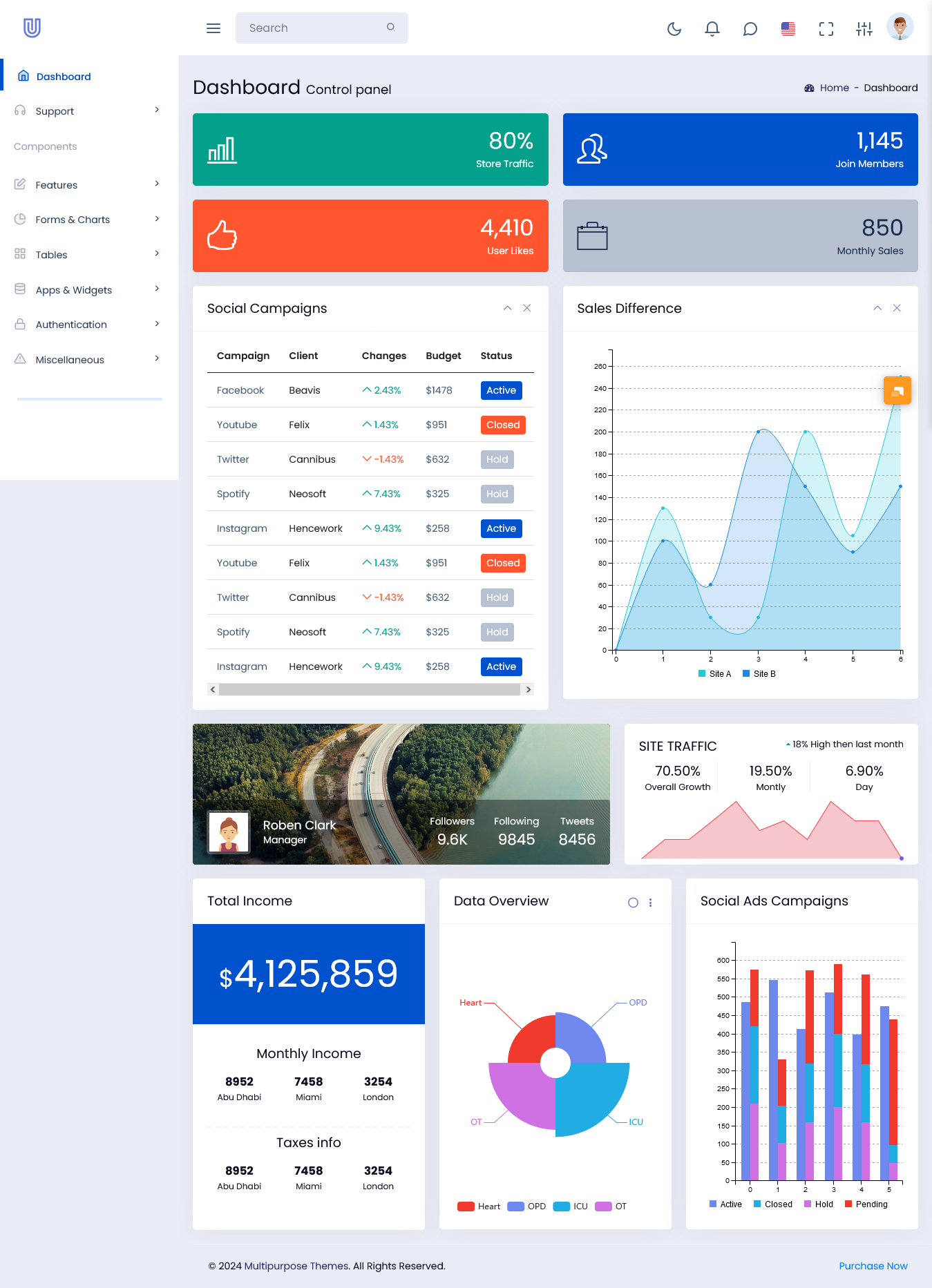
Vertical Dashboard
MORE INFO / BUY NOW DEMO
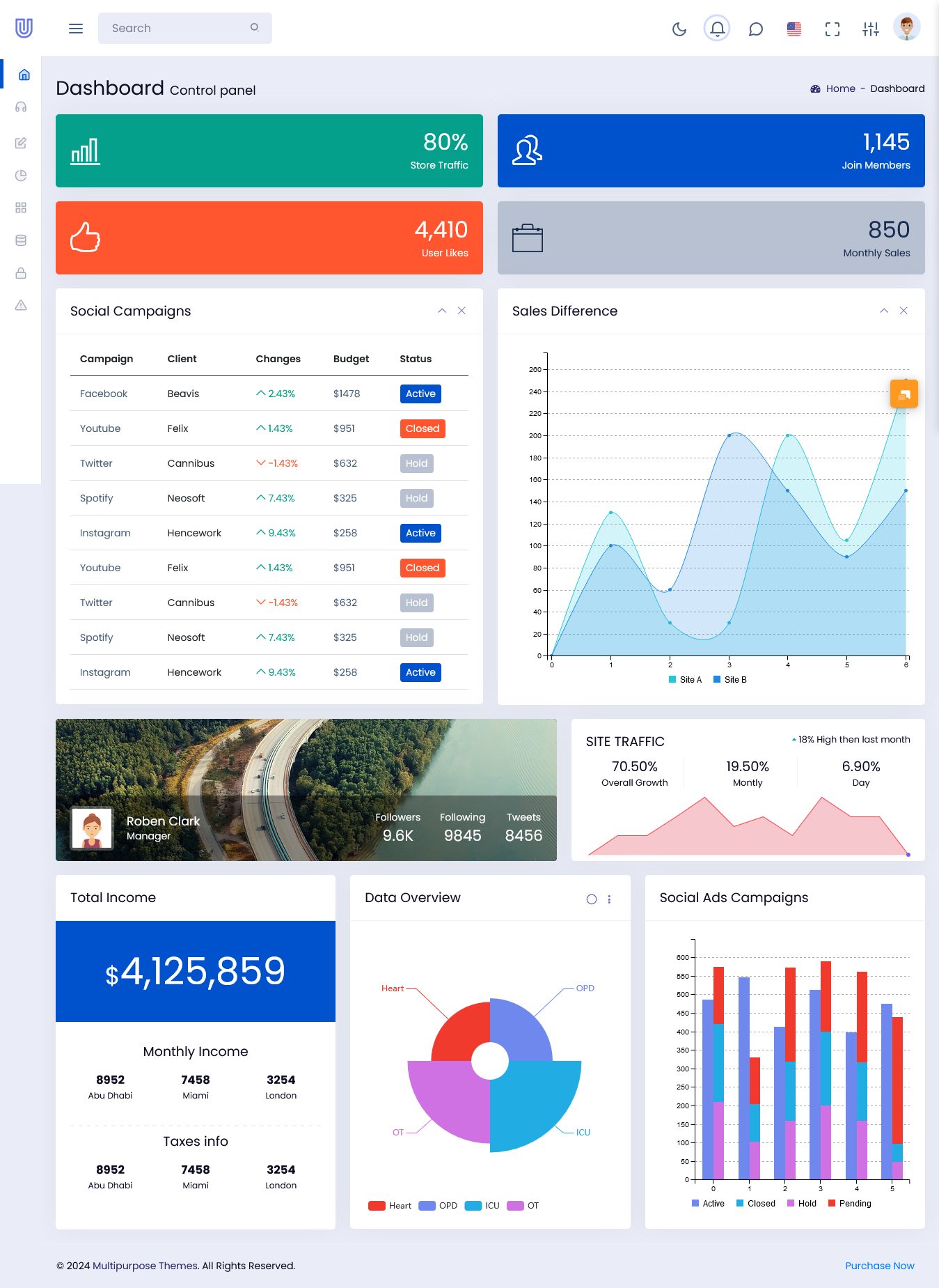
Mini Sidebar Dashboard
MORE INFO / BUY NOW DEMO
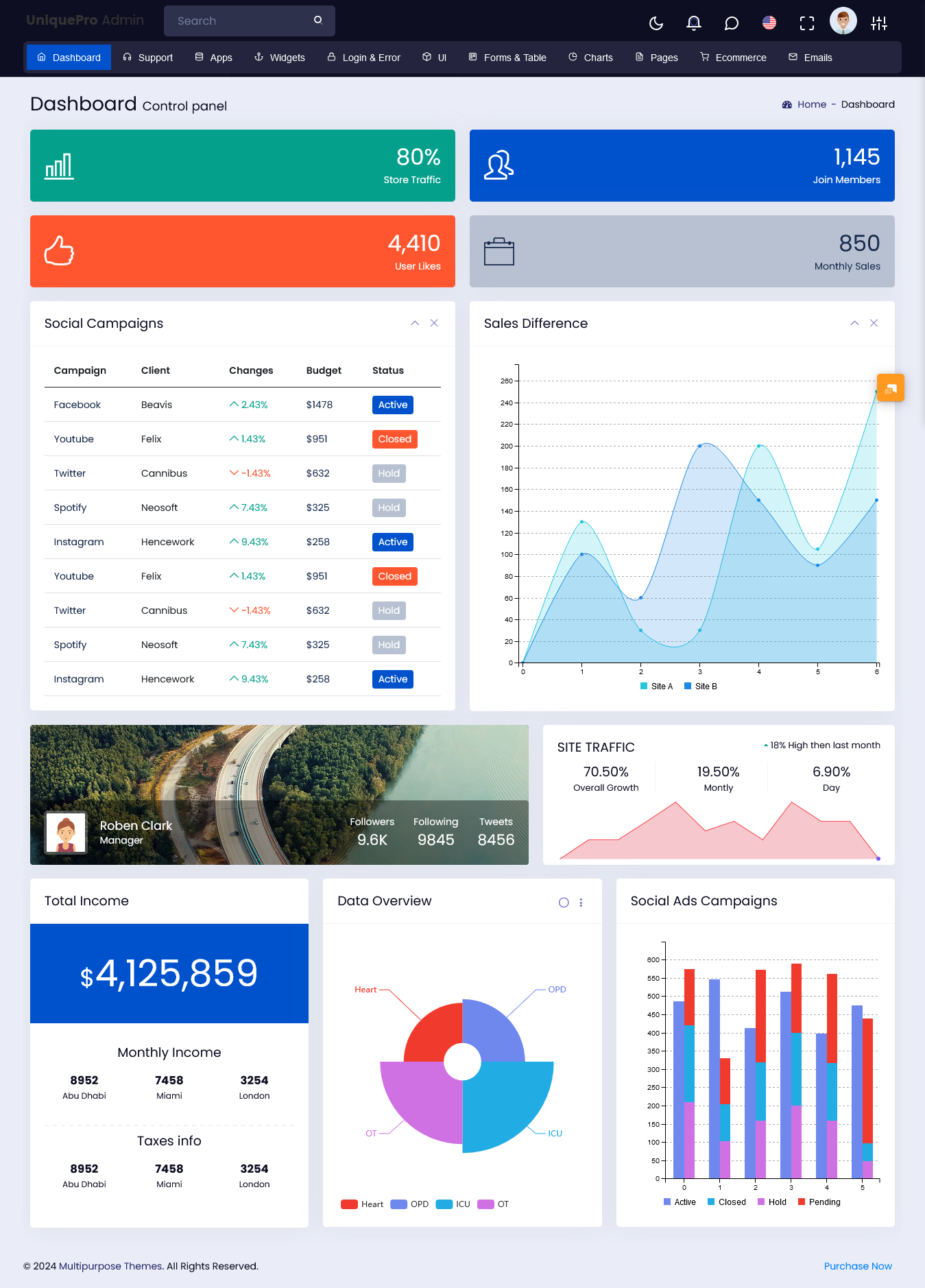
Horizontal Dashboard
MORE INFO / BUY NOW DEMO
Using Bootstrap components
Bootstrap comes with a rich library of pre-designed components that increase usability and save development time. By leveraging these components, you can create a polished and professional looking admin dashboard.
Essential components include a navigation bar, which can be customized to fit the structure of your application. The sticky navbar is particularly useful, allowing users to access key areas of the dashboard without having to scroll. Cards are another great component for displaying information in an organized manner; They can represent different data sets or functionalities, making it easier for users to scan through the content.
Modals can be used to present additional information or actions without navigating away from the current page, helping users focus and reducing unnecessary clicks. Incorporating these elements into your design not only improves aesthetics but also functionality.
Focus on responsiveness
With the increasing use of mobile devices, it is essential to ensure that your admin template is responsive. Responsive design adapts to different screen sizes, providing the best user experience regardless of the device being used. Bootstrap’s responsive grid system is designed to create a fluid layout that automatically adjusts based on screen size.
To achieve responsiveness, use Bootstrap’s grid classes effectively. For example, implementing classes like `.col-md-6` or `.col-lg-4` allows your layout to adapt to different devices. For more customized styles, use CSS media queries to adjust the design for different screen sizes. It is important to regularly test your admin interface on multiple devices to ensure both functionality and aesthetics are maintained across all platforms.
Enhance navigation
Effective navigation is a fundamental aspect of any user-friendly interface. Users should be able to find what they need quickly and effortlessly. There are several strategies to enhance navigation in your Bootstrap admin template.
The implementation of breadcrumb navigation helps users understand their current location in the app and makes it easy for them to return to previous pages. The search bar is another crucial feature; It allows users to quickly find specific content or functionality. Bootstrap’s form controls can be styled to seamlessly integrate into your design.
Additionally, consider using a collapsible sidebar for your main navigation. This keeps primary options easily accessible while allowing users to focus on their current tasks. A well-structured navigation system will significantly improve the user experience.
Establishing a visual hierarchy
A clear visual hierarchy of Dashboard Template helps draw users’ attention and makes it easier for them to process information. This can be achieved through effective use of typography, color and spacing. Bootstrap provides several utility classes that can help create effective visual hierarchies.
Using different font sizes and weights can help distinguish headings from body text, making it easier for users to scan content. Color contrast is also crucial; Make sure there is enough contrast between text and background colors to increase readability. Strategic use of color can highlight important actions or data.
White space also plays an important role in visual hierarchy. Adequate spacing between elements improves readability and prevents the interface from feeling crowded. By carefully establishing a visual hierarchy, you make it easy for users to navigate your dashboard and find the information they need.
Inclusion of feedback mechanisms
Giving feedback to users is essential to enhance their experience. Users need to know that their actions are recognized, and feedback mechanisms can effectively achieve this. Bootstrap makes it easy to incorporate various responsive components into your admin interface.
Use alert components to notify users of success or failure when performing actions. For example, a success message after submitting a form can reassure users that their task has been completed successfully. Loading indicators, such as spinners or progress bars, help indicate ongoing processes, manage user expectations, and prevent frustration.
Tooltips and popovers can also be valuable for providing additional information about buttons or features without cluttering the interface. By implementing these feedback methods, you can improve user engagement and satisfaction.
Priority accessibility
Creating an accessible user interface ensures that all users, including people with disabilities, can interact effectively with your application. When designing with Bootstrap, consider several accessibility practices.
First, make sure all interactive elements are accessible via keyboard navigation. Users should be able to navigate through the interface logically using the tab key. Thoroughly test your application to confirm that keyboard navigation works smoothly.
Descriptive alt text for images and icons must be added for users who rely on screen readers. This ensures that all content is accessible to everyone. Additionally, consider implementing ARIA (Accessible Rich Internet Applications) roles to improve screen reader compatibility. Bootstrap components can often be enhanced with ARIA features, making the interface more usable for all users.
Regular testing and revision
Once you’ve implemented your design, regular testing and iteration is crucial to ensure ongoing usability. Conduct usability testing with real users to gather feedback on your interface. Observe how users interact with the dashboard and identify any pain points or areas for improvement.
Conclusion
Creating a user-friendly interface with Admin Template involves a blend of thoughtful design, effective use of components, and a deep understanding of user needs. By prioritizing simplicity, responsiveness, and efficient navigation, while also focusing on visual hierarchy and feedback mechanisms, you can develop a dashboard that enhances user experience and productivity. Remember to make accessibility a priority and to regularly test and iterate on your design based on user feedback. By following these principles, you’ll be well on your way to creating an effective and user-friendly admin interface that meets the needs of all users. Happy designing!

