Improve Reporting with Analytical Dashboard Features
What Is an Analytical Dashboard?
An Analytical Dashboard is a powerful visualization tool that displays key metrics and patterns to help teams make data-driven decisions. Unlike basic dashboards that only show numbers, it integrates Analytical Charts—like line, bar, pie, and radar charts—to provide actionable insights in real time.
With a top-tier Bootstrap Admin Dashboard or Premium Admin Template, users can explore trends, spot anomalies, and track performance across multiple functions and departments—all from one centralized interface.
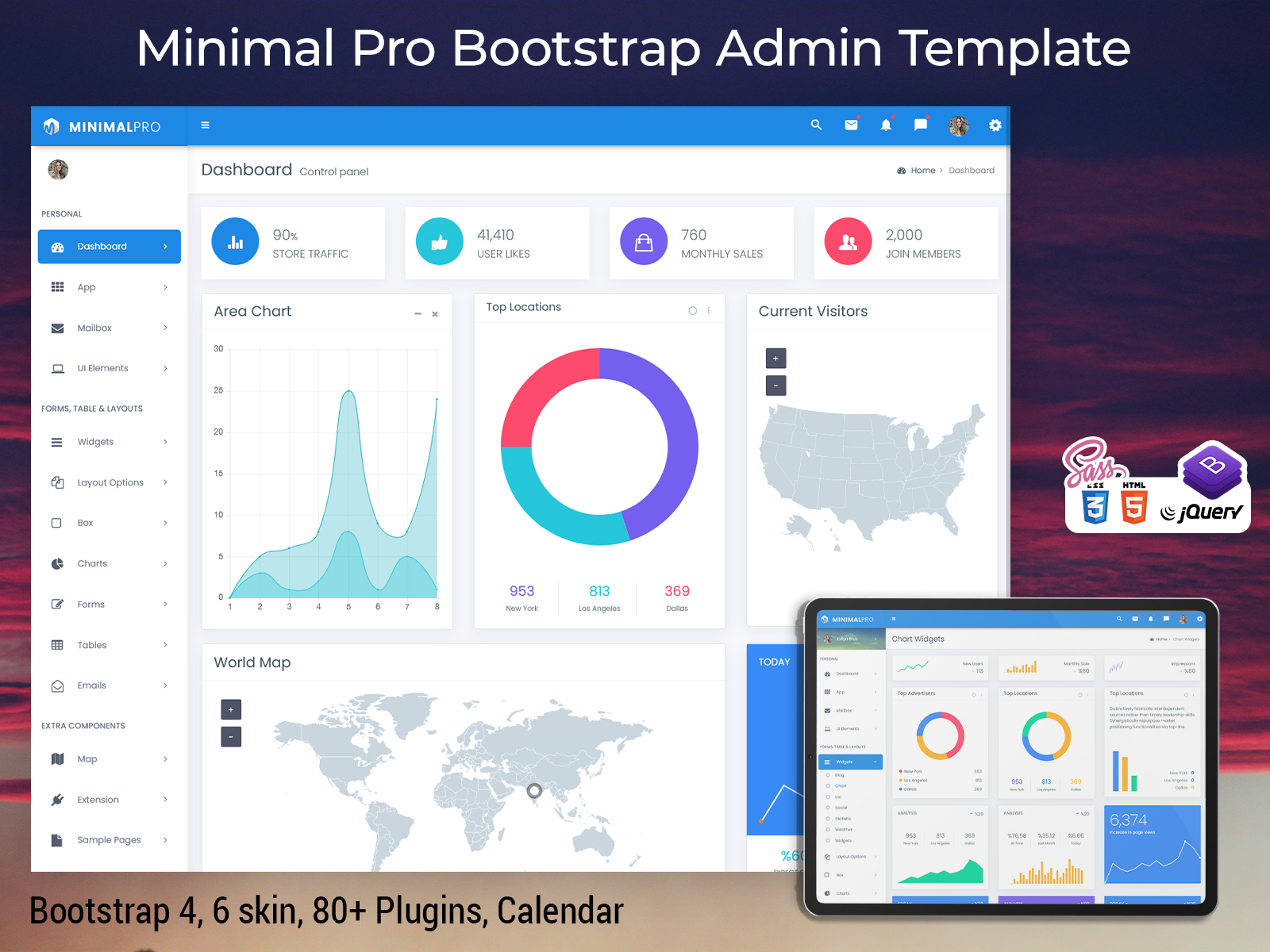
Explore Dashboard Design of Analytics – Minimal Pro Admin
Light Mode Dashboard – Horizontal Style

BUY NOW DEMO
Dark Mode Dashboard – Horizontal Style
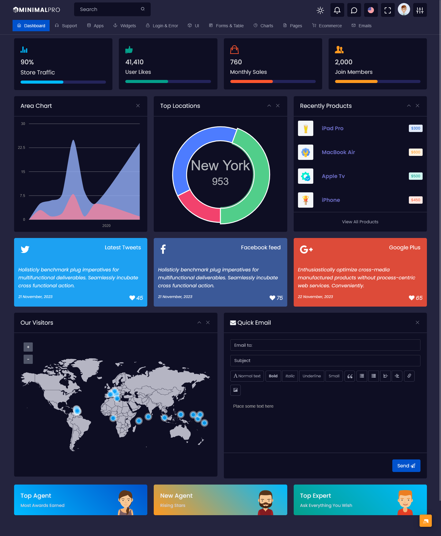
BUY NOW DEMO
Why Use an Analytical Dashboard?
1. Faster, Smarter Decisions
With dynamic data updated live, a great Admin Template with analytical capabilities gives managers the clarity needed for swift, effective choices.
2. Holistic Business View
From finance to marketing to ops, a unified Admin Dashboard UI Kit brings together disparate data, making it easy to compare performance across teams.
3. User-friendly Interface
Built as a Bootstrap Admin Template, these dashboards are both visually attractive and easy to navigate, requiring minimal onboarding.
4. Flexible & Customizable
A versatile UI Framework allows customizing lights, darks, RTL, horizontal or mini-sidebar layouts to match your brand and user needs.
Essential Metrics to Track in an Analytical Dashboard
A robust Analytical Dashboard should include:
– Traffic & Engagement Metrics: Visitors, session duration, device usage
– Sales & Revenue Graphs: Daily, weekly, monthly trends
– Conversion Rates: Funnel insights—trial signups, purchases, renewals
– User Behavior Flows: Page visits and on-site behavior paths
– Geographic Data: World maps, country-based performance
– Real-time Updates: Current users, live alerts, notifications
– Operational KPIs: Inventory levels, fulfillment times, support tickets
These metrics provide a 360° view, helping teams pivot proactively instead of reacting retroactively.
Benefits of an Analytical Dashboard
1. Enhanced Collaboration
An Analytical Dashboard makes it easy for teams to stay on the same page. Everyone can view the same data in real-time using a shared HTML template dashboard. This reduces miscommunication, builds alignment, and helps different departments work together more smoothly.
2. Increased Efficiency
No more chasing spreadsheets or creating reports manually. Analytical Dashboards automatically pull together all your key metrics in one place. This saves hours of work and gives your team more time to act on insights rather than collecting data.
3. Fully Responsive Design
Thanks to a Bootstrap Admin Template, the dashboard works perfectly on all devices—laptops, tablets, and smartphones. Whether you’re in the office or on the move, you can access your data anytime, ensuring fast decisions at the right moment.
4. Multiple Layout Options
Different businesses have different needs, and Analytical Dashboards get that. With layout choices like Light, Dark, RTL, Mini Sidebar, and Horizontal views, you can personalize your dashboard to match your workflow and comfort, enhancing the overall user experience.
5. Tons of Widgets & Plugins
Dashboards like Minimal Pro come loaded with 85+ integrated plugins and over 120 HTML pages. You get built-in analytical charts, calendars, chat modules, font icons, and much more. These powerful tools help you build smarter dashboards without starting from scratch.
Would you like me to write a conclusion or CTA to go with this section?
Dashboard Features
The Minimal Pro Bootstrap 5.2 Admin Template includes:
– Analytical Charts — bar, pie, line, radar, bubble, donut, sparkline, Morris, Flot, Piety, ChartJS
– UI Components — buttons, forms, tables, maps, draggable portlets, progress bars
– Layout Control — boxed/fixed layouts, collapsible sidebar, light/dark themes, RTL and horizontal menu
– Pages — user profiles, invoices, emails, error pages, FAQ, pricing, gallery
– Admin Template features: 6000+ icons, responsive design, retina-ready UI
These components make it one of the most capable Bootstrap Admin HTML solutions available.
FAQs
Q1: Is an Analytical Dashboard hard to learn?
Not at all. A Premium Admin Template designed on Bootstrap ensures a familiar, intuitive interface—perfect for non-technical users.
Q2: Can it integrate with my existing systems?
Yes. You can plug this Admin Template into your backend—ERP, CRM, Salesforce, or custom database—and connect APIs for real-time data.
Q3: Does it work for mobile use?
Absolutely. From major Bootstrap Admin Dashboard layouts to responsive layouts, these are built to look and function beautifully on all device sizes .
Q4: What kind of charts are included?
The template features a wide range—line, bar, pie, radar, bubble, donut, sparkline, Morris, Flot, Piety, ChartJS, and more .
Q5: Can I customize layout and theme?
Yes. The dashboard supports Light, Dark, RTL, Mini Sidebar, and Horizontal modes—all responsive and easy to switch between.
Final Thoughts
An Analytical Dashboard backed by a strong Bootstrap Admin HTML UI framework is more than a reporting tool—it’s a strategic asset. With features like diverse layout modes (light, dark, RTL, horizontal), advanced charting, responsive design, and hundreds of UI elements, it transforms raw data into actionable insights.
The Minimal Pro Bootstrap 5.2 Admin Template is a top-tier example of a complete Admin Dashboard UI Kit—flexible enough for any business need, from startups to enterprise-scale operations. Explore the live demo and see how intuitive, powerful, and visually compelling an analytical dashboard can be.
For more premium Bootstrap Admin Templates, please visit our website. Explore a wide range of powerful and customizable dashboards tailored to your needs!
Bootstrap Admin Template