Analytics Dashboard for Business Insights
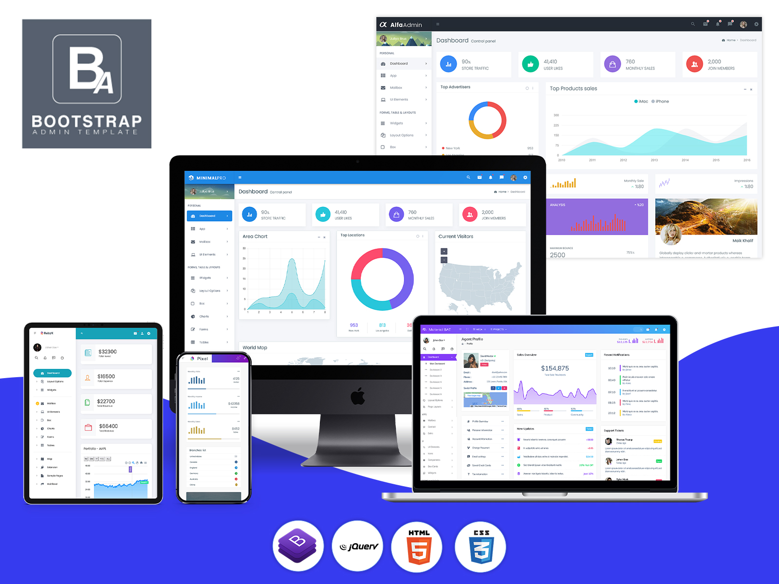
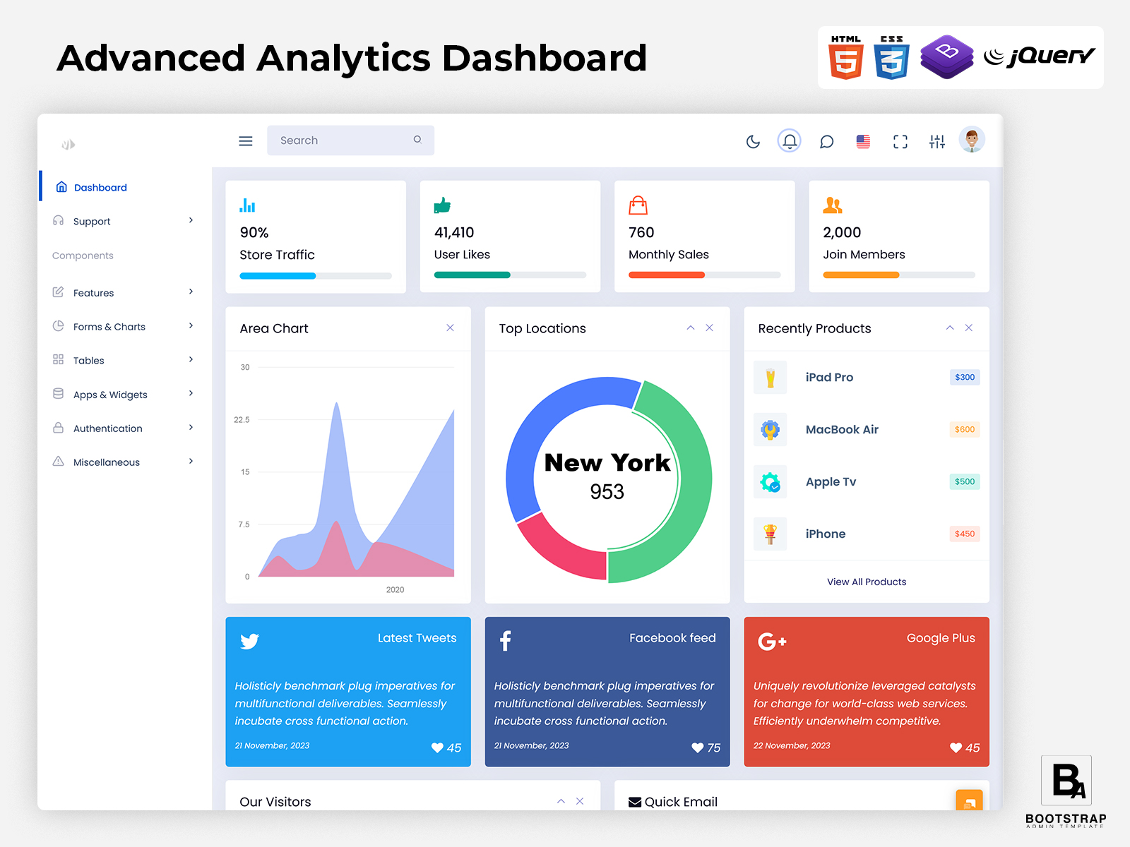
An Analytics Dashboard provides an environment where crucial data can be brought together. The dashboard can provide information in an organized way such that users can monitor trends, make comparisons between time frames, research anomalies, and find out what is of importance.
Instead of regarding analytics as just a bunch of figures, a properly designed dashboard can ensure that data becomes an integral part of the work process. Different views can be adopted by different groups according to their specific roles, whereas managers can have access to more general information.
What Is an Analytics Dashboard?
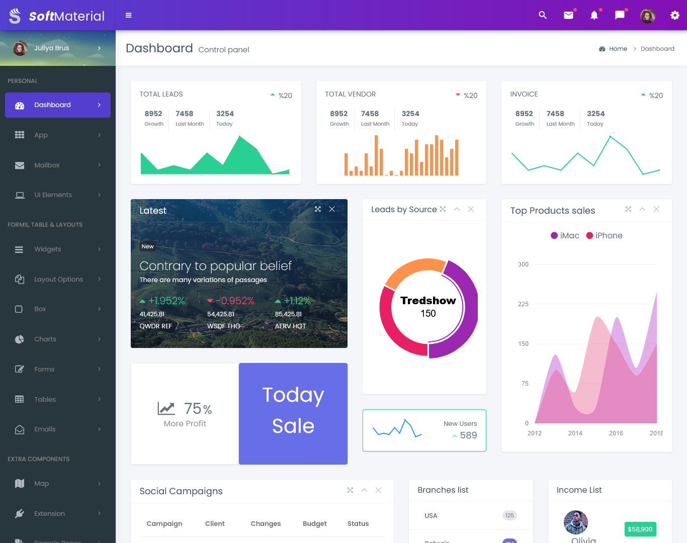
An Analytics Dashboard is a digital interface that organizes business or application data into an accessible visual workspace. It allows users to review information from different areas of a system and understand how activity is changing over a selected period.
The information presented on the dashboard will vary depending on the objective of the application. The e-commerce company may be interested in tracking information about orders, products, customer behavior, and financials. The SaaS company may be more concerned about users’ activity, subscription, and feature usage. The marketing department might be interested in tracking their campaigns, traffic sources, conversions, and users’ behavior.
The dashboard becomes useful when these individual measurements are presented with enough context to understand them. A number by itself may not explain whether performance has changed. Comparing the current period with a previous period, viewing information by category, or examining a trend can provide a more meaningful picture.
A dashboard for analytics administration is mostly intended for users who have to administer the data generated through the administrative end of an application. There could be various levels of access available to allow the analysts, managers, administrators, and other users to handle their relevant data.
Another important part of analytics is filtering. Users may not always want to see every available record. They may need information from a particular date range, region, product category, customer group, campaign, or department. A dashboard that supports these types of views can make large datasets easier to investigate.
For developers, an Analytics Dashboard Template provides a pre-designed interface foundation. It can contain layouts, navigation structures, data tables, cards, filters, and other reusable elements that can be connected to an application’s actual data.
The template does not automatically create the analytics itself. Data collection, database queries, APIs, calculations, permissions, and backend logic still need to be implemented. The dashboard provides the interface through which those results can be presented and explored.
Features of an Analytics Dashboard
1.Context-Based Data Views
A useful dashboard can organize information according to a selected business objective. Instead of displaying every available metric, it can group related measurements so users can understand a particular area without unnecessary distraction.
2.Period Comparison
Comparing different time periods can reveal whether activity is changing. Users may compare daily, weekly, monthly, quarterly, or custom ranges depending on the type of information being analyzed.
3.Interactive Filtering
Filters allow users to narrow the information displayed on the screen. Data can be separated by date, location, product, customer group, campaign, department, or other attributes supported by the application.
4.Detailed Data Tables
Visual summaries are useful for spotting patterns, but users sometimes need the underlying records. Tables can provide more detailed information for reviewing individual transactions, users, events, or other data points.
5.Drill-Down Views
A dashboard can allow users to move from a broad summary toward more specific information. For example, a manager may begin with overall activity and then open a particular department, product category, region, or campaign to investigate the underlying change.
6.Data Export
Some analytics workflows require information outside the dashboard. Export options can allow authorized users to download selected data or reports for further analysis, documentation, presentations, or internal review.
7.Role-Based Analytics
Not every user needs access to every dataset. An Analytics Admin Dashboard can be structured around permissions so that users see the information appropriate to their role while sensitive or restricted data remains limited to authorized accounts.

VIEW DEMO BUY NOW
How an Analytics Dashboard Makes Data More Usable
The information provided by raw data is hard to understand since it is usually presented in large tables that include a lot of records. It could be transactions, customer actions, marketing activities, and other events; however, just having them does not mean anything at all.
An analytics interface creates a layer between the raw information and the person trying to understand it. It can group related records, calculate useful measurements, arrange information by time, and provide different ways to examine the same dataset.
For example, a business might notice that overall website activity has increased. That information becomes more useful when the team can investigate where the additional activity came from. Was it a particular marketing channel? A specific region? A new product page? A seasonal change? The dashboard can provide the filters and related views needed to investigate those questions.
This makes analytics less about looking at a single number and more about understanding relationships between different pieces of information.
An Analytics Dashboard Template can help developers create these workflows without designing every interface element from the beginning. A developer can use an existing layout as the foundation and connect it to APIs or backend services that provide the application’s actual data.
The interface can also be structured differently for different users. A marketing employee may need campaign and traffic information, while an operations manager may care more about order volume and processing activity. Executives may need a concise summary rather than a detailed table of individual events.
This flexibility is important because a dashboard should support the questions users need to answer. If everyone sees the same collection of unrelated measurements, the interface can become difficult to use even when the underlying data is accurate.
Building an Analytics Dashboard Around Questions, Not Just Metrics
One useful approach to analytics design is to begin with the questions users regularly ask.
A sales manager may want to know which products are changing in demand. A product team may want to understand how users interact with a new feature. A marketing team may need to identify which campaigns are generating meaningful engagement. A finance team may be interested in changes in revenue or transaction patterns.
These questions can determine which information deserves a place on the dashboard.
For example, if the main question concerns product demand, the interface might organize information by product category, sales period, customer segment, and inventory movement. If the purpose is application usage, the dashboard may instead focus on active users, feature interactions, session behavior, and changes over time.
This approach can prevent dashboards from becoming crowded with measurements that nobody regularly uses.
An Analytics Bootstrap Dashboard can provide a flexible frontend foundation for implementing these different analytical experiences. Bootstrap-based structures can be adapted to create cards, tables, filters, navigation areas, forms, and other interface components according to the project’s requirements.
The development team can then connect those components to live application data. This separation between interface and data logic allows the same general structure to be adapted for different analytics applications.
Another consideration is how users move from summary information to details. A useful dashboard should not force users to search through an unrelated page every time they notice something unusual. Providing logical links between summaries and detailed records can make investigation more efficient.
Analytics Dashboard for Different Types of Applications
An analytics interface can be useful far beyond traditional business reporting.
For ecommerce applications, the dashboard can organize information around customer activity, orders, product movement, returns, and purchasing patterns. The goal is to help administrators understand what is happening across the store rather than simply displaying a total sales number.
For SaaS products, analytics can focus on how users interact with the application. Teams may need to understand account activity, feature usage, subscription behavior, or changes in engagement.
For content platforms, the dashboard can organize information around page visits, content performance, audience behavior, publishing activity, and referral sources.
For internal business systems, analytics may focus on employee activity, project progress, support requests, operational workloads, or departmental performance.
This variety means that an Analytics Dashboard should not be treated as a fixed collection of charts. The interface should be capable of changing according to the data model and questions associated with the application.
Benefits of Analytics Dashboard
1. Brings Data Together
An Analytics Dashboard can organize information from different parts of an application into one working environment. Users can review related measurements together rather than repeatedly switching between separate reports and administrative screens.
2. Makes Trends Easier to Notice
Changes can be difficult to recognize when information is viewed only as individual records. Organized historical comparisons and trend views can help users notice increases, decreases, recurring patterns, and unusual changes more easily.
3. Supports Focused Investigation
Filters and detailed views allow users to move beyond a general summary. They can narrow information by relevant categories and investigate the specific area responsible for a change or result.
4. Reduces Manual Report Checking
A centralized dashboard can reduce the need to repeatedly collect information from different sources for routine monitoring. Frequently required data can be presented through a consistent interface for authorized users.
5. Helps Different Teams Work With Relevant Data
Different dashboard views can be designed around different responsibilities. Marketing, sales, operations, product, finance, and management teams can access information that relates more closely to their particular work.
6. Creates a Flexible Reporting Foundation
A customizable analytics interface can evolve as business requirements change. Developers can introduce new measurements, filters, data sources, and views without necessarily replacing the complete dashboard structure.
7. Makes Large Datasets More Manageable
Search, filtering, grouping, summaries, and detailed records can help users work with large amounts of information more comfortably. This gives teams multiple ways to move between an overall picture and specific records.
BootstrapAdminTemplate for Analytics Dashboard Development
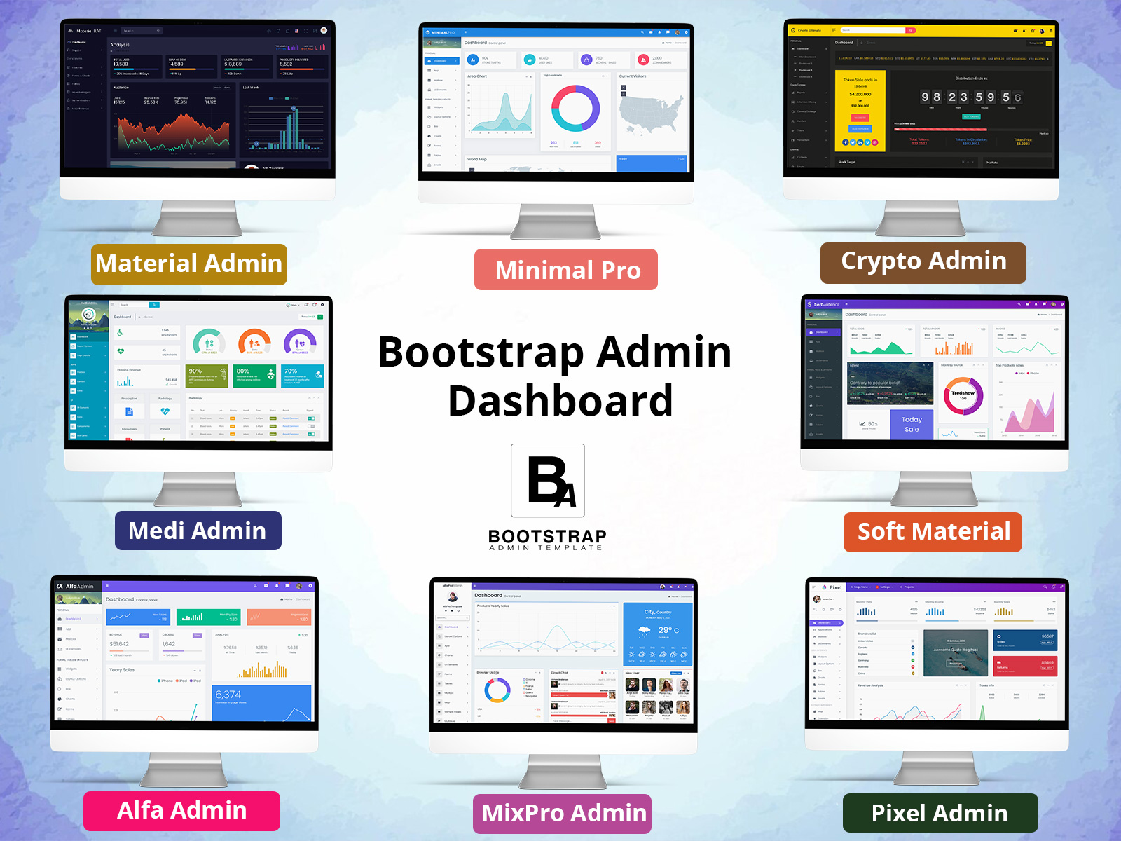
BootstrapAdminTemplate provides ready-made Bootstrap admin interfaces and dashboard resources that developers can adapt for data-driven web applications. Its existing products include reusable layouts, dashboard components, charts, tables, forms, widgets, and application pages, while some templates specifically demonstrate analytics-oriented views.
For developers building an analytics application, these resources can provide a frontend starting point instead of requiring every interface component to be designed from scratch. The available structure can be adapted to the project’s data model, user roles, reporting requirements, and application workflow, while the development team connects the interface to its own backend and data sources.
This approach can be useful when the goal is to spend more development effort on the actual analytics logic and application functionality rather than repeatedly creating basic administrative interface elements.
Conclusion
An Analytics Dashboard can turn large amounts of application or business information into a more organized working environment. Its usefulness comes not simply from displaying data, but from helping users compare information, investigate changes, and understand what deserves further attention.
The best dashboard structure depends on the questions users need to answer. An ecommerce team, product team, marketing department, and operations manager may all work with different information even when they use the same underlying application.
An Analytics Dashboard Template can provide a practical starting point for building these experiences. Developers can customize the interface around their data sources, user roles, filters, reporting requirements, and application-specific workflows.
An Analytics Admin Dashboard can also grow alongside an application. As new data becomes available, teams can introduce additional views or reporting sections without having to rebuild the entire administrative interface.
For projects that use Bootstrap, an Analytics Bootstrap Dashboard can provide a flexible foundation for organizing data tables, filters, summaries, and other interface elements. The final quality of the analytics experience will still depend on the accuracy of the underlying data, calculations, backend architecture, permissions, and implementation.
VIEW DEMO BUY NOW
Frequently Asked Questions
1. What should an Analytics Dashboard include?
A Bootstrap Admin Template Analytics Dashboard can include summary information, historical comparisons, filters, detailed tables, trend views, drill-down sections, and data export options. The exact features should depend on what users need to monitor and which questions the application is designed to answer.
2. Can an Analytics Dashboard Template be connected to live data?
Yes. A dashboard template can be connected to live application data through APIs, backend services, database queries, or other integrations. The template provides the frontend structure, while developers implement the data retrieval, calculations, authentication, and business logic required by the project.
3. What is the difference between an Analytics Dashboard and an Analytics Admin Dashboard?
An Analytics Dashboard is a general interface for viewing and analyzing data. An Analytics Admin Dashboard specifically focuses on the administrative side of an application, where authorized users may monitor system activity, manage datasets, review reports, and access analytics according to their assigned permissions.
4. Is an Analytics Bootstrap Dashboard suitable for different types of projects?
Yes. A Bootstrap Admin Template analytics interface can be adapted for ecommerce, SaaS, finance, marketing, education, logistics, internal business applications, and other projects. Developers can modify the data views and interface components according to the application’s specific requirements.
5. Can users filter data inside an analytics dashboard?
Yes. Filtering can be implemented according to the available data. Common examples include date ranges, locations, product categories, customer groups, departments, campaigns, or account types. Filters are particularly useful when the dashboard needs to work with a large dataset.
6. Can an analytics dashboard show detailed information behind a summary?
Yes. Bootstrap Admin Template Developers can implement drill-down functionality that allows users to move from a general summary into more specific information. For example, a user might open a category, region, campaign, or product from a summary view and inspect the records contributing to the displayed result.
7. Can an Analytics Dashboard be customized for a company’s requirements?
Yes. A Bootstrap Admin Template dashboard can be customized around the organization’s data sources, user roles, reporting needs, terminology, navigation, and workflows. Developers can add or remove views and connect the interface with the company’s existing systems rather than treating the template as a fixed final application.